
For Caribou Coffee, taking the long view in its current rebranding efforts meant embracing its original seize-the-day slogan, “Life is short. Stay awake for it.”
The Minneapolis-based coffeehouse chain updated its logo, packaging and signage to shift its emphasis from merely “staying awake” to being a brand central to an engaged lifestyle, said senior vice president of marketing Alfredo Martel.
Starting with the introduction of several premium menu items in the fourth quarter of 2009 and including the rollout of vibrant brand materials in March and a relaunched website in April, Caribou sought to elevate its positioning in the marketplace with a new look and greater focus on the customer experience.
“We’ve modernized our whole brand architecture, but we brought back our most beloved tagline,” Martel said. “As we looked at the recommitment to quality and experience, that saying rang so true.”
“The new ’Bou,” as Martel calls it, paid off with a 5.2-percent increase in same-store sales for the April 4-ended first quarter, compared with a year earlier.
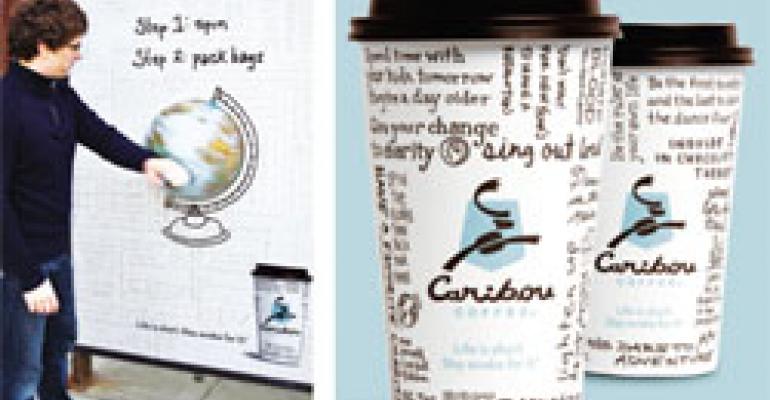
Reawakening sales Since the arrival of chief executive Mike Tattersfield in August 2008, Caribou had changed course from system expansion to improving service and growing sales at the unit level, officials said. As the rebranding developed over the latter part of 2009, it encompassed not only a new look, but new product offerings as well. “We did a lot of soul searching in terms of what’s at the core of our brand proposition, and the customer experience rang so loud and critical,” Martel said. “So we recommitted to living up to providing that experience, and the path was product innovation.” The first new products to emerge from the process were mochas and chocolate drinks made with real Guittard chocolate, which debuted last December, followed by oatmeal, which rolled out this past January. When Caribou released much of its new signage and packaging March 1, it also introduced Tea Latte Fusions in four flavors. The rebranded collateral materials debuted after several of the upscale menu items because of longer lead times needed for production and distribution to Caribou’s 534 locations, Martel said. He added that new posters and packaging and even the updated logo had to reinforce the quality-lifestyle expectations set by the new products. “The new look had to reassure our guests that it’s about that great experience and at the same time have that humor and optimism that’s part of the brand,” he said. The total package Caribou and its agency of record, Minneapolis-based Colle+McVoy, depicted that optimism and “carpe bean” mentality graphically by printing dozens of “Bou-isms” on cups and point-of-purchase posters. The hand-written Bou-isms are sayings, platitudes and suggestions inspired by the tagline—like “hold hands, not grudges” or “take all your vacation days”—gathered from Caribou and agency employees, as well as from brand loyalists on Caribou’s Facebook page. “Instead of creating a new tagline, we embraced what Caribou has always had,” said Eric Husband, Colle+McVoy’s group creative director. “It’s a lifestyle mantra. We created these Bou-isms so that, rather than being just a message about caffeine, it was a ‘seize the day’ message.” Caribou’s new logo also had several updates, including a caribou composed of a coffee bean for the body and a “C” for the antlers. The color was switched from black to brown, to better represent the product offering, Husband said. The shield switched to one shaped more like the shield of the National Park Service and painted what Colle+McVoy dubbed “Denali blue,” an homage to Caribou’s founders being inspired to start the company during a trip through Denali National Park in Alaska years ago. Timing is everything The lead times for collateral materials and development of Caribou’s new website forced those initiatives to go live after some of the product rollouts, but chain and agency officials said spreading out the campaign would help it last. The phased rollout of the rebranding let Caribou make a splash but avoid the “cannon ball in the pool,” Husband said. “We looked at it as a smart way to do this so we didn’t just inundate people for a month,” he said. “We’ll be able to sustain it throughout the year.” Caribou most recently unveiled its outdoor-advertising initiatives to show off the “new ’Bou,” including billboards and bus signage loaded with Bou-isms as well as interactive bus shelters, which make for a more prudent investment in warmer months. “Seasonality was in play,” Martel said, “as was not being wasteful. And spending media dollars in winter is problematic, so we moved our media investments away from inclement-weather months. Spending $100,000 in D.C. in the middle of Snowmageddon [the severe storm in the mid-Atlantic in February] would have hurt us severely. [The rebranding] went in-store first, packaging next, and now a relaunched website and a media campaign.” The coffeehouse chain also continues to make product news, introducing two Rainforest Alliance-certified coffee varieties, Lacuna and Lakeshore Blend. Caribou plans for all of its coffee blends to be certified 100-percent sustainable by Rainforest Alliance by the end of 2011.—[email protected]