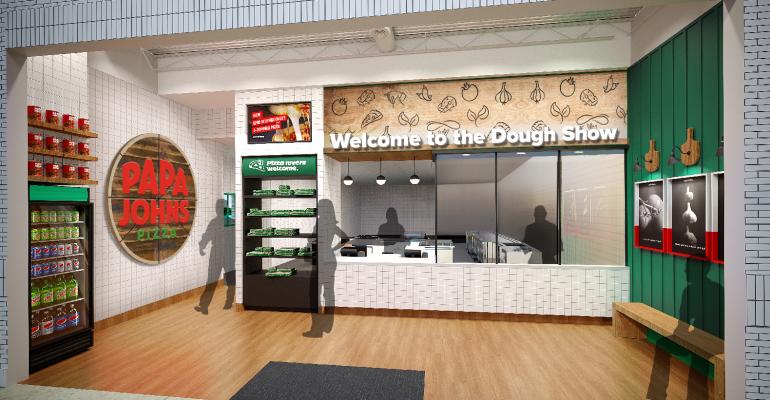
Papa John’s International, Inc. is celebrating its nine quarters of growth with a makeover: the pizza chain announced Tuesday a refreshed logo and color scheme, as well as a new store design with an open floor plan and easier customer access to omnichannel ordering and pickup options.
The brand evolution is being dubbed “Hungry for Better” and emphasizes a more modern, customer-centric look with a visual focus on the simplicity of Papa John’s ingredients — like the large murals of high-definition closeups of pizza ingredients that will dot the walls — and its people, whose stories will be utilized in marketing campaigns.
“The goals of our new restaurant concept are to create a streamlined and flexible environment for team members to create quality food more efficiently, and for customers to enjoy seamless purchasing and pickup experiences,” Kate Carpenter, senior director of brand advertising and design at Papa John’s told Nation’s Restaurant News. “Throughout the physical space, we've added some handcrafted details and personalization. To make it more inviting and reflective of the craft and care that goes into making all our products.”
A notable aspect of this rebranding effort is that the Louisville chain has quietly dropped the apostrophe from its name, becoming Papa Johns minus the possessive. This effort seems to be the company's effort to distance itself from Papa John Schnatter, the pizza chain's controversial founder. Papa Johns did not directly address the association with Schnatter, saying in a statement that, "the removal of the apostrophe from the names of brands is not abnormal," and pointing out that other brands have done so like Wegmans and Michaels.
"Better has always been at the core of what Papa Johns stands for, and we are continuing that quest for better in everything we do – from our menu innovations to our company culture to our consumer experience and brand marketing," a Papa John's spokesperson said in a statement. "Our new brand visual identity is a celebration of the results we have achieved and an illustration of the direction we are moving to continue that success into the future.
The newly dubbed Papa Johns is emphasizing efficiency in this rollout, both for customers and employees. Customers will now be able to pick up their orders at the drive-thru, at the “drive-up, pickup” second lane for orders placed ahead of time, and the indoor pickup counter, which is now self-service, so customers can contactlessly grab their orders without waiting in line.
“Our customers want choice and control over the experience,” Carpenter said. “We translated that to create a customer-centric design that offers a range of fulfillment options, making it easier for our customers to place their orders, get in and get on their way.”
For employees, the kitchen utilizes a modular make line, which allows the same space to be used to prepare different products at different times.
“The [kitchens are] definitely designed with efficiency in mind so that making all of our products will be less time-consuming and switching from product to product will be less labor intensive, which will obviously help with some of the labor challenges that we're seeing,” Carpenter said.
The new restaurant design — which is set to roll out gradually to stores, with an emphasis on new restaurants — is accompanied by a refreshed logo and color scheme, featuring a color palette inspired by the colors found in Papa John’s products (mainly basil green, marinara red and dough off-white, and even yellow-green to represent the famous Papa John’s pepperoncini finishing touch). Existing stores will have the opportunity to update their signage and other store designs if they so choose.
Papa John’s will be announcing more brand aesthetic and design changes in the months to come.
Contact Joanna at [email protected]
Find her on Twitter: @JoannaFantozzi


