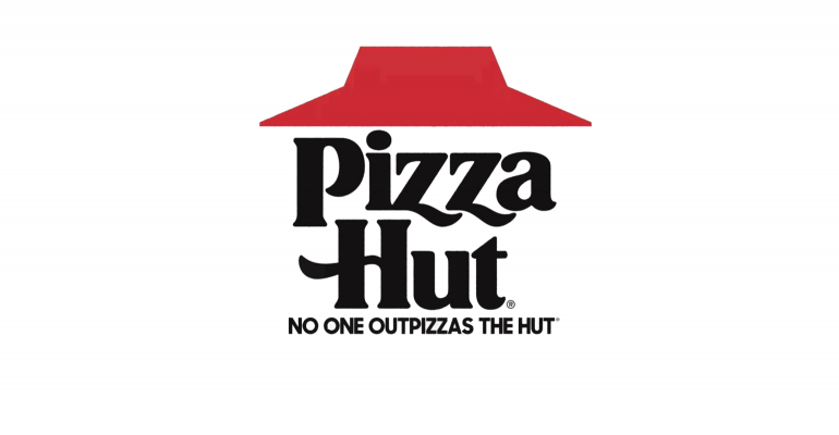
Despite attempts to pivot from its legacy dine-in restaurants, Pizza Hut is bringing back the brand’s throwback red-roof logo design to boldly remind consumers they are the “OG” of pizza chains.
“It’s about celebrating where we came from,” Marianne Radley, Pizza Hut chief brand officer, told Nation’s Restaurant News this week.
For too long, Pizza Hut has been polite and shy about its legacy, she said. The Plano, Texas-based chain, founded in 1958, has lacked the confidence to be boastful about the brand.
That’s changing as of next week, when the new logo rolls out during a national TV campaign.
“We have to be a little braver, a little bolder in our choices,” she said.
The chain, troubled by lackluster sales in the U.S., has been rethinking its marketing program since last summer. During market research sessions with consumers, guests responded enthusiastically when discussions turned to legacy brand features such as the red-roof restaurants and the red-and-white-checkered tablecloths.
Fans with love for the brand’s history gave the “brand permission to be bold” and shout out that Pizza Hut is the “OG of the pizza category,” Radley said.
Pizza Hut is introducing the throwback logo next week with a TV ad campaign supporting the limited-time return of Cheesy Bites Pizza. The so-called appetizer-and-pizza-in-one pie, which first debuted three years ago, has a crust made of 28 cheese-filled bites.
“We get a lot of fervor over it. It’s a nice pizza for sharing,” Radley said.
She said the popular LTO is the perfect platform for showcasing the return of the cleaner, old-fashioned red-roof logo, which was used in the 1960s and 1970s.
It moves away from the current “scripted and tilted” logo, which contains an outline of the roof, but it is white, not red. The red-roof icon with “Pizza Hut” in black font makes the “brand pop,” Radley said.

The new logo will debut on packaging including boxes and during NFL promotions in the fourth quarter of this year. Pizza Hut, a division of Louisville, Ky.-based Yum Brands, is entering its second year as official pizza sponsor of the National Football League.
Digital platforms will transition to the retro logo over the next few weeks.
The move to change the logo comes amid a brand transformation for Pizza Hut. Over the past year, Pizza Hut has worked to revitalize the brand through value promotions and growing carryout-focused restaurants.
 Though the company has invested capital in delivery and smaller format restaurants, last year company president Artie Starrs said he was frustrated that the brand is not getting credit for those changes.
In many parts of the country, especially markets with a heavy presence of legacy “red roof” dine-in restaurants, consumers don’t realize the chain delivers.
Radley said the opposing strategies — delivery versus red-roof image — can work together.
“Red roof is an iconic asset. It’s a brand tone change, not an infrastructure change,” she said.
Pizza Hut has more than 16,800 restaurants around the world. Of those, about 7,500 are in the U.S.
Contact Nancy Luna at [email protected]
Follow her on Twitter: @fastfoodmaven


