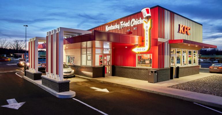
KFC is looking to make a comeback with major development plans for the Yum Brands-owned fried chicken brand, and a significant part of that will be the smaller, off-premises-focused Next Generation store prototypes. The new store prototypes were initially announced at the end of 2020 and the first opened in Berea, Ky. in Q4 of 2021, followed by Next Gen stores in Westfield, Mass. And Detroit, with the eventual goal of phasing out the heritage American Showman store design.
Last quarter, KFC was net new unit positive for the first time in 17 years, with 55 units opened in 2021, with plans to overhaul its system of mostly classic American Showman store models (70% of the store system today). The Next Generation store prototype emphasizes all off-premises needs with a drive-thru lane for mobile orders and a shelving system for mobile order pickups and delivery couriers all packed inside a smaller footprint.
KFC also plans to use this updated store design to guide its urban strategy, with an aggressive expansion strategy planned for urban markets like St. Louis, New York (Chinatown, Queens, and Harlem), and Baldwin Park, Calif., as NRN previously reported.
“Our focus is on elevating KFC’s distinctive identity further and make it more modern,” Pradnya Bendre, director of KFC U.S. architecture and design development told Nation’s Restaurant News. “We wanted to make sure that our assets stay relevant for years to come, not just in terms of brand positioning, but in the ability to absorb the digital tech innovation, new channels such as off premise, and any other future expected innovations that might come our way.”
Two of the crucial elements of the Next Generation store design are making sure to appeal to every type of customer — from the family in the drive-thru lane to the digital customer that wants to be in and out as quickly as possible — and giving each customer easy access to what they need.
“We want to make sure our online customers have a really quick in-and-out with their orders,” Bendre said. “We are seeing increasing orders coming online. […] We had to make sure that through design, we make it easy and frictionless for those online customers.”
Wayfinding is particularly important for customers in this new design:
“We made things like dedicated parking spots for people when they drive and signs guiding them to where they need to go to pick up their orders on the shelf within the restaurant. That particular entrance is different than dining room entrance to make it even easier.”
Contact Joanna Fantozzi at [email protected]
Follow her on Twitter: @joannafantozzi


