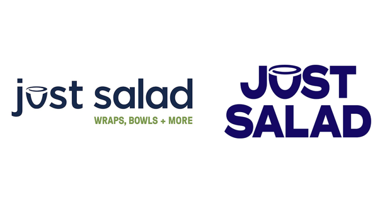
Just Salad, the New York-based fast-casual restaurant, has upgraded its logo and photography, the brand said on Monday. The new logo, however, still maintains the chain’s signature reusable bowl that the chain has become known for.
“We really wanted to talk to our current salad brand lovers and get them more excited about what we’re doing to really push the boundaries and flavors, sustainability and service,” said Jennifer Lally, vice president of marketing for Just Salad. “We’re excited to talk to those people who maybe have never tried this before to [get them to] say, ‘Wow, what’s Just Salad doing?’”
The chain’s new logo also comes with a new, broader color palette. These colors are meant to speak to a wider range of customers and give the brand’s 17-year-old logo a refresh.
In addition to updating the logo and color palette, the chain has also hired a new photographer for its imagery. The new photographs are food-forward, according to Lally.
“We want to lead with mouth-watering photography that creates this desire [for our food] and really excites the senses and captures a craving that people want,” she said.
To get to this place in the redesign, Just Salad reached out to current and former customers to get a pulse on what they should or shouldn’t change.
Lally was certain to say, however, that the brand’s mission has not changed despite the rebrand. Just Salad, which was B-Corp certified earlier this year, remains committed to sustainability and customer health.

